CREATIVE INTELLIGENCE STUDIO
Brand & identity
The best tribute to Steve Jobs does not even mention his name
New Balance just gave everyone a little lesson in branding.
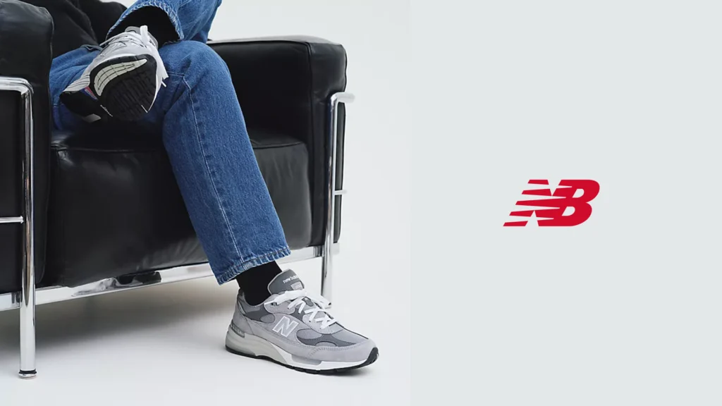
October 5 marked 15 years since Steve Jobs passed away. No commemorative campaign, no inspirational quote, no black-and-white portrait with “Think Different” written across it. New Balance kept things much simpler.
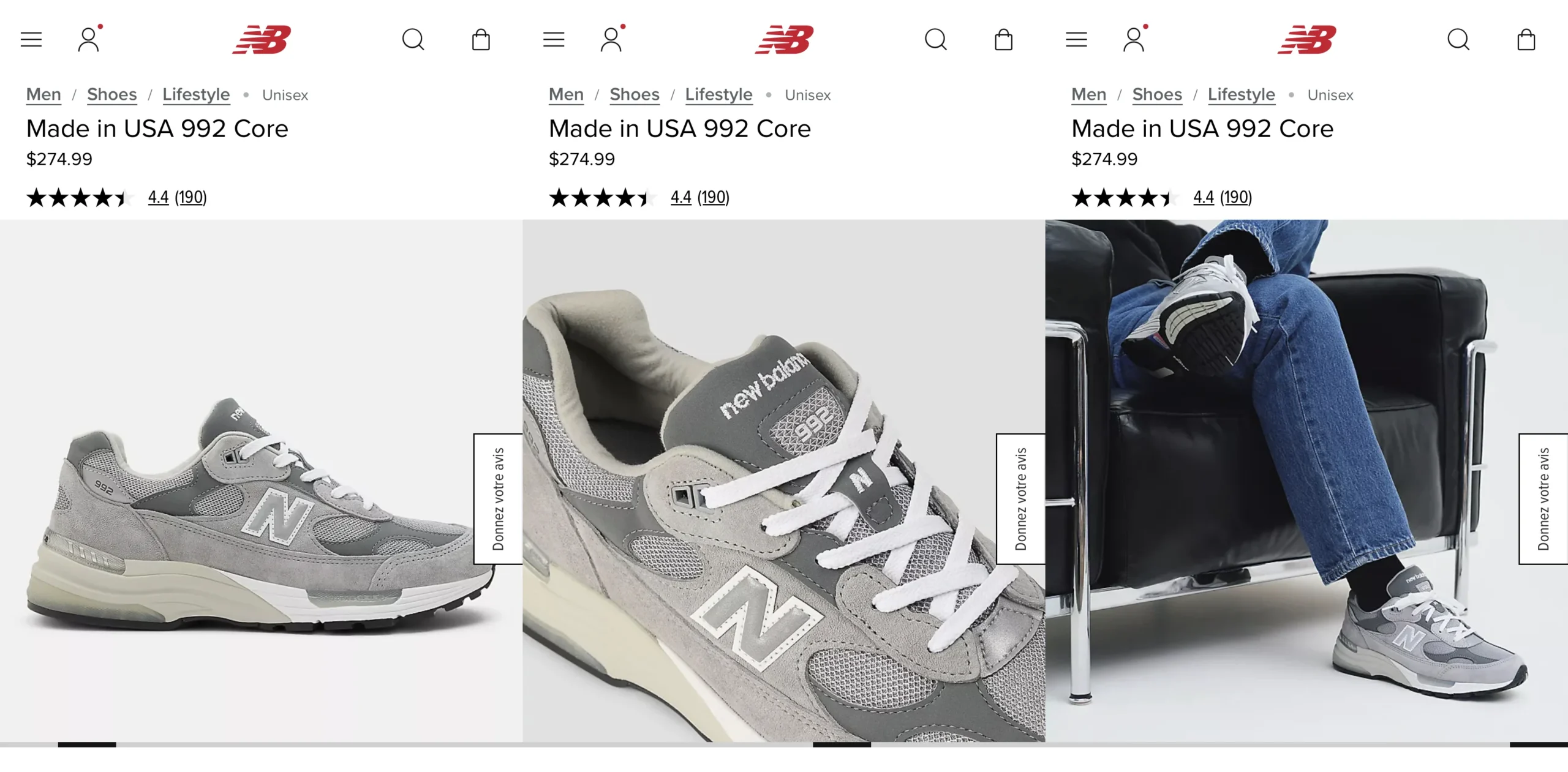
Among the photos of its grey 992s, the brand slipped in an image of a man sitting in a black armchair, legs crossed, wearing blue jeans, black socks and, of course, a pair of 992s. If you know a little about Apple’s history, the reference is immediate.
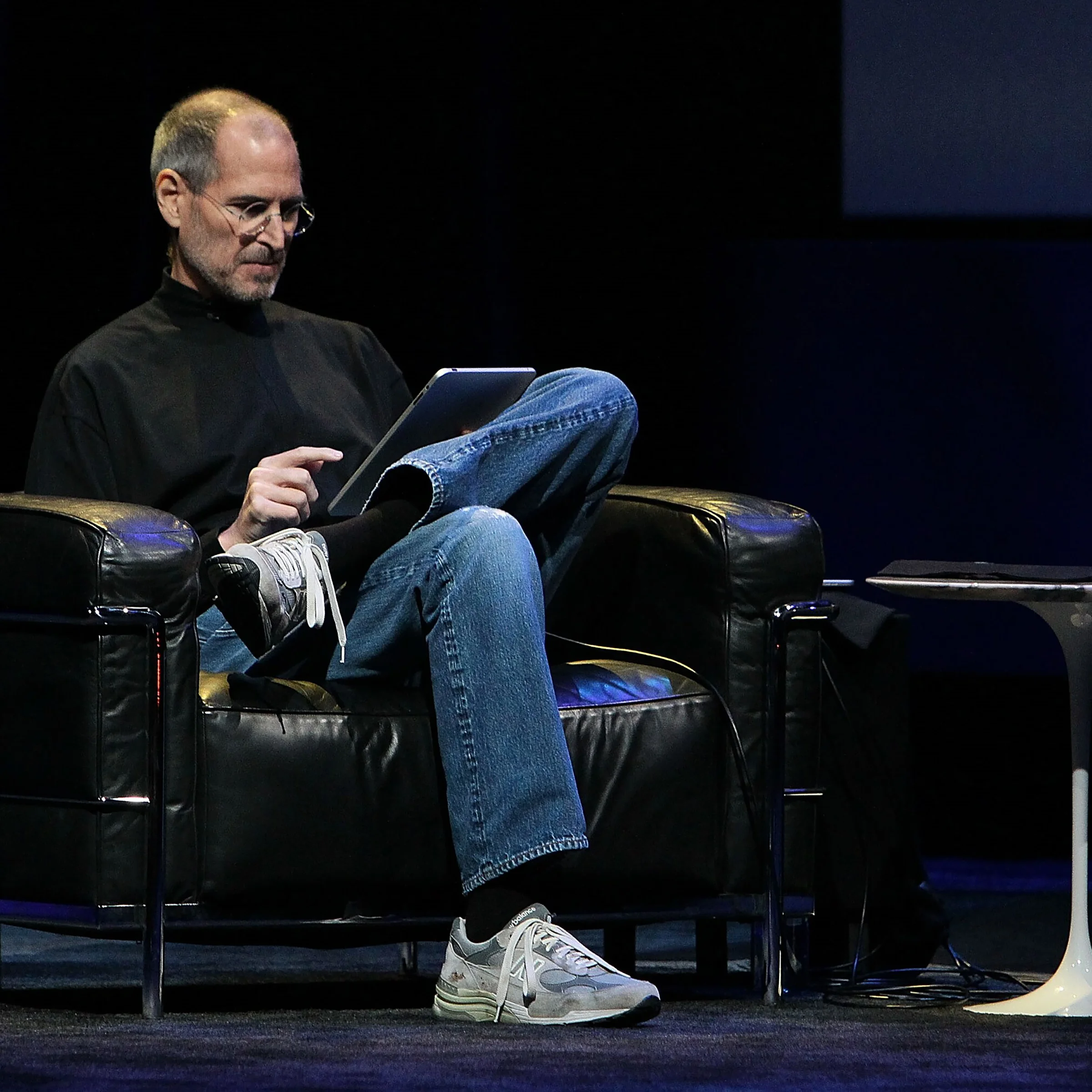
It is practically Steve Jobs’s pose when he introduced the first iPad in January 2010. The same shoes he regularly wore, the same kind of chair, the same posture. A few details are enough to make the connection.
And New Balance says nothing. There is no need. That is precisely what makes the idea so good: the reference works without having to explain it.
A brand does not always need to shout
We talk a lot about storytelling in marketing, often to the point of overdoing it. Here, the story lives in a few visual details. People who get the reference feel like they have discovered something. Those who do not simply see a nice product photo.
No big message explains the joke. No red arrow, no “tribute to Steve Jobs.” The brand trusts its audience. And when an idea is strong enough to work without instructions, that is usually a good sign.
Steve Jobs helped make the New Balance 992 iconic without setting out to. Fifteen years after his passing, New Balance returns the nod in what is probably the most fitting way possible: with almost nothing. And it is perfect that way.